CLUTTERMEISTER
  • home
  • virtual services
  • clutteraware
  • speaker
  • clues
    • blog
    • audiovisual
    • publications
    • in the media
    • testimonials
  • contact

Avoid 'Death by PowerPoint"

17/1/2017

 
Picture
“Death by PowerPoint is a phenomenon caused by the poor use of presentation software. Key contributors to death by PowerPoint include confusing graphics, slides with too much text and presenters whose idea of a good presentation is to read 40 slides out loud.”

Sadly, this describes the majority of presentations I’ve had to endure in my professional life. How is this possible? I believe that we have become entranced by the technology at our disposal. The slide show itself has become the centre of attention. That is not necessarily a problem, but if the talk is too weak to draw the attention back to the speaker, or if the presentation is badly thought out, the point of talking (i.e., getting information from the speaker to the audience) is missed completely. Shouldn’t we be asking “How do I best get my point across without too much distraction?” rather than “How can I spice up my presentation?”
So let’s address the three common issues mentioned in the definition above:
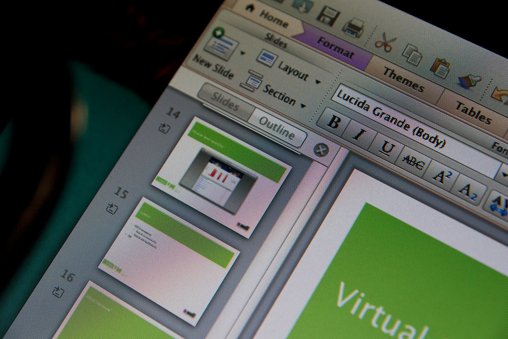
Too much text
This is easily explained: the slides are used as handouts at the same time. This means that ALL the information has to go onto the slide, which makes for a good handout and a horrible slide.
Use the slides to support your talk: only show some keywords that give your audience an idea what you are currently talking about, so they can listen to what you have to say. In addition, create a proper handout for distribution in an easily readable format.
Reading out loud
Reading out text from the big screen, often with the back turned to the audience, is another staple of public speaking.
Most people do not know this, but presentation software usually has an integrated option to create speaker’s notes. Do get acquainted with that function and make use of it. Your listeners will thank you for that.
Confusing graphics
A slide can be extremely useful to present information that cannot be conveyed in words, especially with images and graphs that underline a point in the talk.
There are two simple rules to follow here: only use images and graphs when absolutely necessary, and make sure that whichever image or graph you use contains information that is clear and easy to understand for the intended audience.
You might think that it is really difficult to get things right. To some degree that is true, but “Death by PowerPoint” really has three main reasons: shoddy slides, bad preparation and panic during the presentation itself. However, there are ways to ensure success:
Good slides
A slide show is the end result of a whole process that starts with your research about the subject, then you create some kind of outline, and that goes into a presentation. Right?
Wrong! This process leaves you with a presentation that serves as a handout, speaker’s notes AND a slide show. With a side-order of formatting issues and losing time in PowerPoint. You’ll save time, have all your materials and end up with a more engaging presentation if you follow these simple steps:
  • Use your talk outline to compose the handout, a proper document that is easy to read. Format it correctly and you’re halfway there. Since this is usually done in a text processor like Word or Write, you’ll be familiar with the process. Don’t worry about the time to spend in PowerPoint later, your document contains all you need to do this quickly.
  • Next: print this and highlight the key points in the document. Only the key points, preferably single words, please! Put a line across the page when you move to another argument or when the subject changes. Use this to create text slides: only copy the keywords on a slide and start a new slide when you come across a line across your handout page (use multiple slides when you have too many keywords). You now have a set of slides containing all your key text points.
  • Create speaker’s notes from your key points: copy all the key points into the speaker’s notes function in your presentation software (or use a separate document if you are not familiar with that function), then add your own keywords that guide you through the talk. This will make sure you stick to the keywords the audience will see, but it will also make the talk distinct from your handout.
At this point, you have created three documents: a proper handout for your audience, speaker’s notes for your talk and a basic version of your slide show to beef out with graphs and images, if necessary. This basic version of the slides can be treated as you would have done anyway, but now you only need to worry about the layout, not the text content. Add any supporting visuals and you should be done in no time at all.
Good preparation
Once your documents are ready, pull everything together! If you have not created the slides and notes yourself, make sure to familiarise yourself with the slides, how they correspond to your notes (make annotations in your notes about the slides, if you can), and check that they are clear. It is imperative to do a full test-run at least once, to avoid surprises. Repeat until it flows.
Something often overlooked is the technology: are you sure you know how to use the technology at the venue? It is imperative to know what you require and to ask those questions before you go there. Do you need a pointer or a clicker to advance your slides? Will you have a secondary screen available in front of you? Can the file with your slides be used on the system (you may have more recent software than they do). You know how you usually roll when you give a talk. All these and other questions determine how your talk will go, and there is nothing more unsettling than last-minute technical hiccups when you should really be ready to go ahead with your talk. Make sure you clarify these things ahead of time.
On site prep
There are a couple more things you should really do at the location itself:
  • Make sure you know how to use the technology at your disposal;
  • If you use sound or video on your slides, test out the quality beforehand (is it loud enough for the last row, is the sound distorted, etc);
  • Put the slideshow on and check if the text can be read from the last row.
All this sounds daunting, I agree, but it’s all a simple questions of experience. At the end of the day, you want to enjoy your time in the spotlights, and one important way to make sure of that is to be properly prepared on the technology level, so you can fully concentrate on the subject you are talking about.
Let’s repeat some of the basic mantras:
  • Make sure the technology works for you, not against you;
  • The audience should concentrate on you, not the slides;
  • Slides serve to underline your talk, not talk for themselves;
  • Keep the number of slides to a minimum;
  • Do not use sentences on the slides, just keywords;
  • Stick to a maximum of 5-7 keywords per slide;
  • Less is more.

Comments are closed.

    Ask the ClutterMeister

    Picture
    Hi, my name is Tilo Flache. My mission: help clients declutter mind and space.
    This blog contains pointers for your journey towards a happier living experience.

    If you want to share a post, please add a link to the original post. Thanks.

    Archives

    June 2025
    May 2025
    April 2025
    March 2025
    February 2025
    January 2025
    November 2023
    July 2022
    November 2021
    October 2021
    September 2021
    August 2021
    July 2021
    June 2021
    May 2021
    April 2021
    March 2021
    February 2021
    January 2021
    December 2020
    November 2020
    October 2020
    September 2020
    August 2020
    July 2020
    June 2020
    May 2020
    March 2020
    February 2020
    January 2020
    December 2019
    November 2019
    October 2019
    September 2019
    July 2019
    June 2019
    May 2019
    April 2019
    March 2019
    February 2019
    January 2019
    December 2018
    November 2018
    October 2018
    September 2018
    August 2018
    June 2018
    May 2018
    April 2018
    March 2018
    February 2018
    January 2018
    December 2017
    November 2017
    October 2017
    September 2017
    August 2017
    July 2017
    June 2017
    May 2017
    April 2017
    March 2017
    February 2017
    January 2017
    December 2016
    November 2016
    October 2016
    September 2016
    August 2016
    July 2016
    June 2016
    May 2016

    RSS Feed

Picture
Picture
Picture
Picture
Picture
All information refers to Tilo Flache t/a ClutterMeister.  © 2015-2025
  • home
  • virtual services
  • clutteraware
  • speaker
  • clues
    • blog
    • audiovisual
    • publications
    • in the media
    • testimonials
  • contact